42
$\begingroup$

EDIT 02:

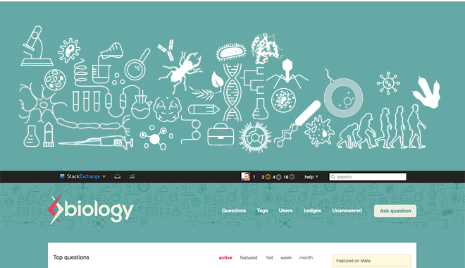
Here is the updated main illustration including most of your feedback.
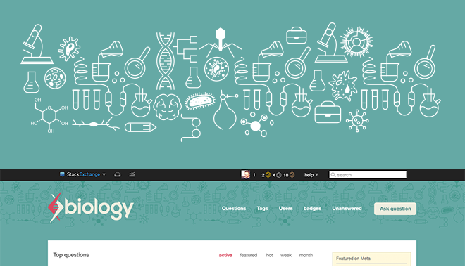
Updated illustration


EDIT 01:

Thanks for your great feedback! This is exactly what I needed, it's hard to know some of the details when you're not a biologist.

I will update the design here soon based on most of your suggestions.


I'm Stéphane, a senior product designer at Stack Exchange. First, I wanted to announce that this site is now starting the process of moving out of beta to become a fully-graduated site! Congratulations!

Graduation and Your Site Design

Graduation comes with a few perks. I have already begun work on your site's design, which will give you your own unique theme that reflects your topic and culture. This will help brand your site as unique, even while you share common elements with other sites that show you are part of a bigger Stack Exchange family.

Once the design goes up, you will receive a link in the footer of other sites in the network, along with the ability to migrate content to and from other sites — and the notoriety of a public launch that says, Congratulations, you finally made it!


Design Concept

For our Biology's site design and branding, we wanted a design that represents biology without being figurative. The main goal is to convey ideas and known shapes in a unique way. We wanted to create a calm and peaceful place like nature.


Color Scheme

Green has always been the color of nature, it symbolizes growth and life in all its forms. The powerful red suggest red blood cells, a light beige balances the color palette.

Color scheme img


Logo & Identity

For the logo, as suggested by the community, I was looking for a unique symbol that represents DNA. It might not represent all of biology but it's the most popular symbol though I tried to get as far as possible from the original shape while keeping it recognizable.

Along with the logo, all the illustrations work as a whole to mimic molecules. They grow in a seamless non-geometric pattern to convey an organic feeling.

Logo img

Here are some examples to illustrate how it can be used elsewhere to strengthen the visual identity.

T-shirt
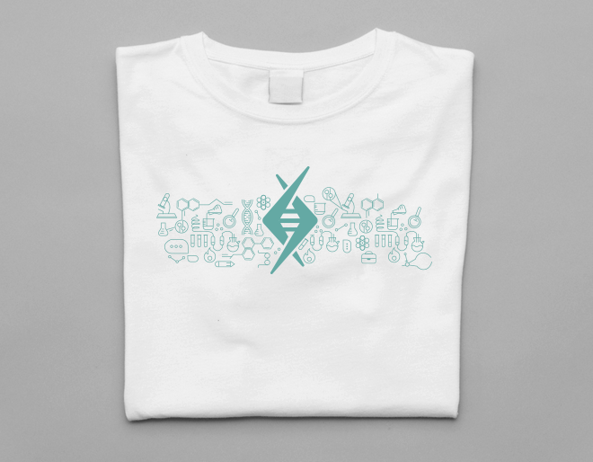
T-shirt

Stickers

Stickers

Note book

Note book


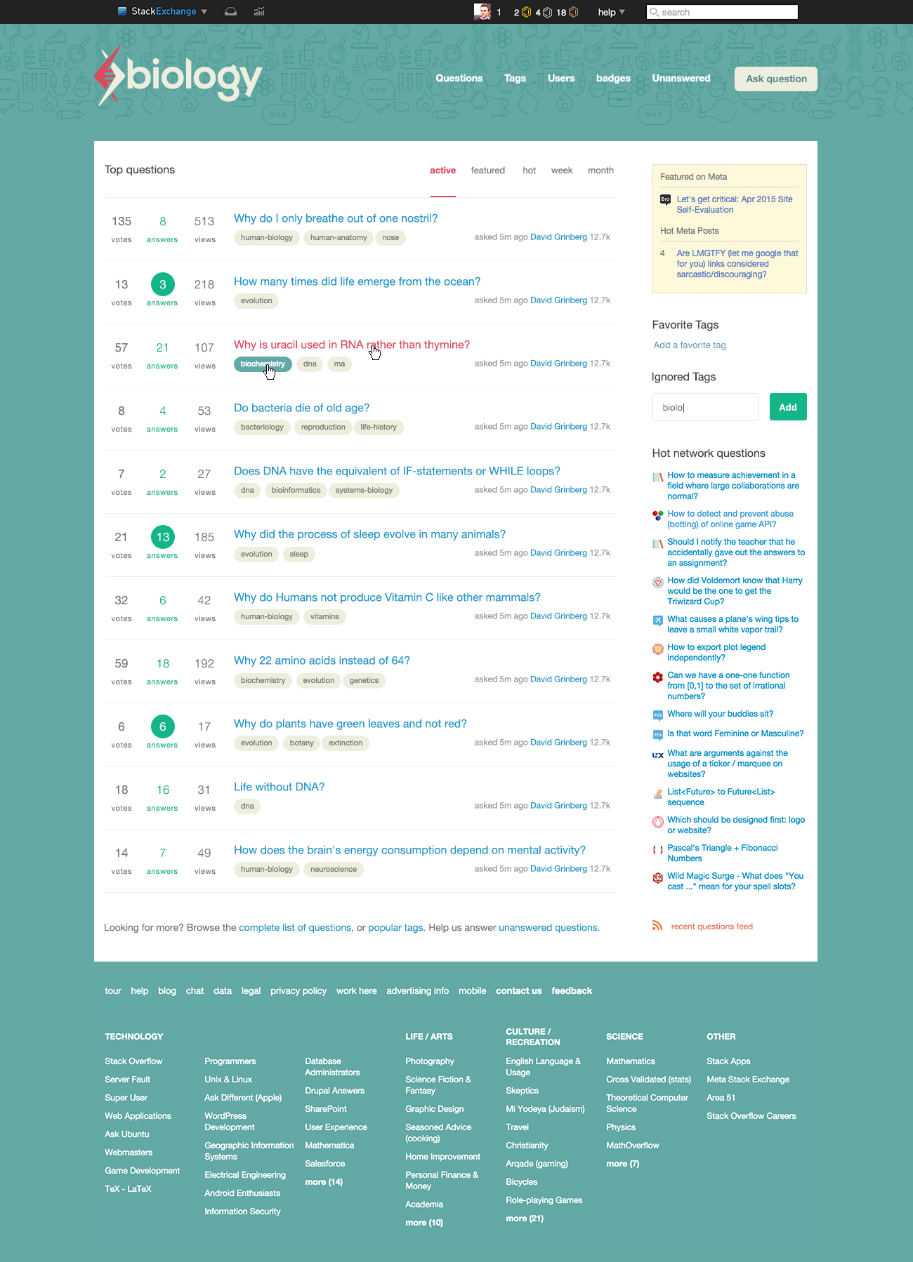
Overall site design

Home page

Click on the image below to see it in full resolution

Home page

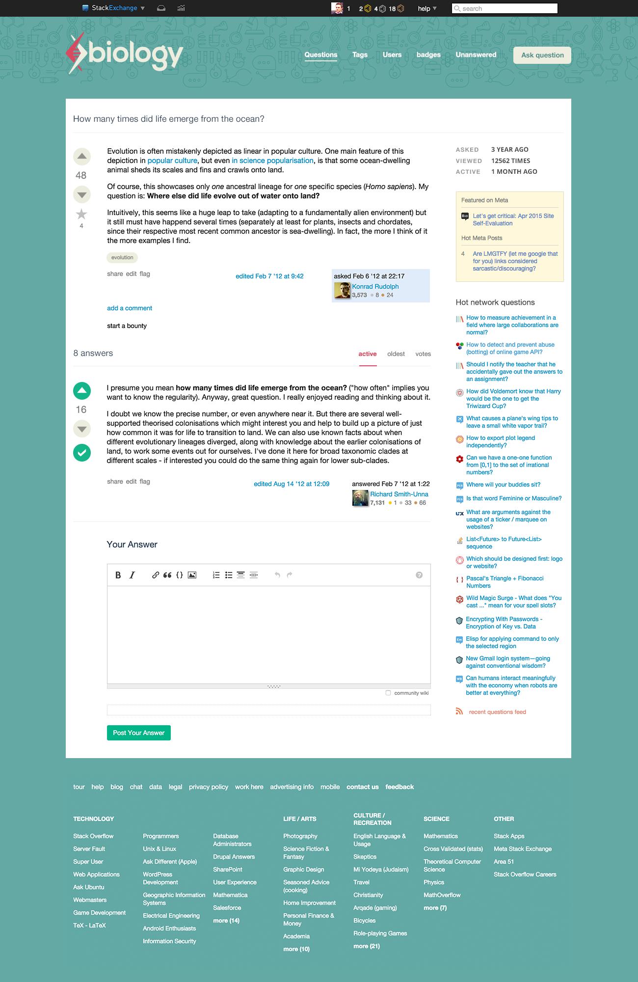
Question page

Click on the image below to see it in full resolution

Question page

Sample Site Illustrations (404, error & captcha)

404, error, captcha


We believe the design and branding work very well for this community, it’s unique and capture the right mood. We’d love to hear your feedback, and if there are no major design changes, we’ll launch the new site design and graduate the site from Beta soon.

Congrats for being an awesome community!

$\endgroup$
20
  • 1
    $\begingroup$ Great news! I have to think about and look at the examples more before posting something more substantial. $\endgroup$ Commented May 13, 2015 at 10:10
  • 1
    $\begingroup$ To clarify, I think that overall the design is great! I really like the colors and the overall feel is very smooth and professional. Please don't take my comments below as anything but suggestions for improvement on an already very good first draft. Your work is very much appreciated! $\endgroup$
    – terdon
    Commented May 14, 2015 at 12:18
  • 1
    $\begingroup$ I agree with @Yes in that benzene is an odd choice. It's an organic chemical that a lot of biologists won't ever come across except in school chemistry lessons. $\endgroup$
    – James
    Commented May 15, 2015 at 1:13
  • $\begingroup$ Out of curiosity, is it going to be called Biology or something more funky... like naturally selected or similar? $\endgroup$
    – Rover Eye
    Commented May 15, 2015 at 9:15
  • 1
    $\begingroup$ @RoverEye It's called Biology $\endgroup$
    – Stéphane Staff
    Commented May 15, 2015 at 11:53
  • $\begingroup$ I love the neuron! Thanks :) $\endgroup$
    – AliceD Mod
    Commented May 18, 2015 at 14:20
  • 1
    $\begingroup$ Why all the nitpicking on benzene? Where would we be without phenylalanine? $\endgroup$
    – canadianer
    Commented May 18, 2015 at 16:30
  • 2
    $\begingroup$ Are you also changing the benzene as badge symbol? That one really does not fit at all to biology. $\endgroup$
    – Mad Scientist Mod
    Commented May 18, 2015 at 18:06
  • $\begingroup$ Also relevant, can we have a preview of the upvote/downvote buttons as well? Most SE sites have interesting custom ones. $\endgroup$
    – March Ho
    Commented May 19, 2015 at 6:40
  • 1
    $\begingroup$ @MadScientist I will change the badge symbol, probably a tiny version of the logo $\endgroup$
    – Stéphane Staff
    Commented May 19, 2015 at 7:56
  • $\begingroup$ Also consider one of the phylogenetic trees used in the banner as badge icons - it would be nice to give evolution a prominent place in the visual design, and I think they would work quite well, while also being recognizable to many. $\endgroup$ Commented May 19, 2015 at 8:04
  • 1
    $\begingroup$ I realize that you have a tough job ahead of you to please everybody ;) $\endgroup$ Commented May 19, 2015 at 8:10
  • 2
    $\begingroup$ If something is going to be repeated (which, I guess, it has to be to deal with different resolutions) could the repeated part be the central, more biological images and not the chemistry ones? It would be even better to remove the chemistry ones altogether but at least let's not make them be repeated. $\endgroup$
    – terdon
    Commented May 19, 2015 at 17:27
  • 1
    $\begingroup$ That logo is... interesting. Is that how baby boomerangs are made? $\endgroup$
    – Jason C
    Commented May 21, 2015 at 3:10
  • 1
    $\begingroup$ This is great news and a great discussion. I feel a bit sorry for Stephane that he has to take on the task to find representative graphics for a field that is as broad as biology. As you probably already figured out, there are just too many different fields to make everybody happy. (For me for example, test tubes match biology perfectly. I handled so many of them while working in the lab as an undergrad.) Kudos for listening to all the great ideas people bring up! We should also remember, that these are design graphics and see them more as art then as made for a textbook. $\endgroup$
    – skymningen
    Commented May 21, 2015 at 5:47

15 Answers 15

28
$\begingroup$

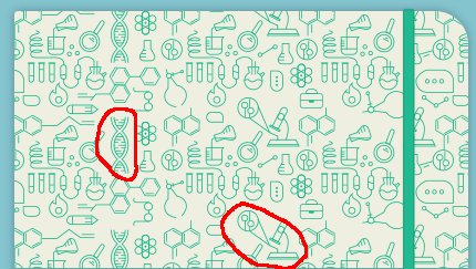
First of all, whohooo! This is great news! Thanks for the design, it does look good and I'm very much looking forward to it. I do, however, agree with @fileunderwater that most of the icons used are more about chemistry than biology. Specifically, of the various icons used, I would only identify the ones shown below as being "biological" as opposed to "chemical":

enter image description here

Of those two, DNA is, of course, DNA and very biological. The second seems to be a microscope which does indeed bring biology to mind, but it looks more like a test tube held upside down. All of the rest are valid for both chemistry and biology but more evocative of chemistry (test tubes, beakers, organic molecules, laboratory miscellanea), or very much more chemical than biological (an atom (?), what looks like a titration experiment) or just generally and vaguely "scientific" (a pencil, a flame, a briefcase (?), a magnifying glass). I would also rather see some more purely biological or, at least, more biological than chemical images.

For example, here are some that occur to me when searching for things that are evocative of biology (the images below are the result of a quick image search and should be taken as very broad suggestions, I'm sure you can do much, much better):

  • A phylogenetic tree;

    phylogenetic tree round phylogenetic tree

  • A sequence alignment;

    sequence alignment

  • A sequence logo

    sequence logo another sequence logo

  • A petri dish, perhaps showing growing colonies;

    petri dish and bacterial colonies

  • Cells;

    cells bacterium

  • Viruses (few things in nature look as naturally cool and badass as viruses);

    a virus HIV virus bacteriophage

  • Classic biological molecules. For example:

    • Sugars

      disaccharide

    • Nucleotides (perhaps this is what you were going for with the benzene rings):

      nucleotide

    • Funky molecular motors like the $F_{1}F_{0}$ atpase

      F1F0 atpase

    • Proteins

      proteins more proteins

    • DNA plasmids

      DNA plasmid Another DNA plasmid

    • Antibodies

      antibody

    • Ribosomes

      a ribosome another ribosome

  • Classic model organisms (blue images taken from http://thenotchmeeting.org)

    • mouse mus musculus

    • C. elegans worm c. elegans

    • Brewer's yeast s. cerevisiae
    • Human human
    • Xenopus frog xenopus
    • Fruit fly drosophila melanogaster
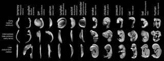
  • Embryos

    various embryos another embryo neurulation

  • Karyotypes

    down karyotype female karyotype

  • Gels

    running gel running gel2

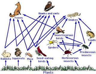
  • Food web

    food web food web 2

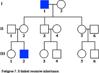
  • Inheritance chart / mendelian genetics / pedigree

    pedigree

Finally, I also agree that the benzene rings for badge images are really not a good choice. There's nothing biological about them. While they do often occur in molecules that are of interest to biologists, they also occur (and more often) in general, organic chemistry. I would instead suggest using small double helices as the badge image. Similar to the logo (which is great, by the way). Something like this ugly mock-up:

example showing helices as badge icons

$\endgroup$
7
  • 3
    $\begingroup$ Great that you've added concrete examples - I didn't have the time. I especially think that phylogenetic trees, cells and a higher organism should be included (along with more biologically interesting molecules) $\endgroup$ Commented May 13, 2015 at 14:04
  • 1
    $\begingroup$ @fileunderwater yeah, I figure that Stéphane is a designer and has no reason to know what biologists think of when they think of biology. Feel free to edit and add more examples, by the way. I added karyotypes and a couple of gels. $\endgroup$
    – terdon
    Commented May 13, 2015 at 14:09
  • $\begingroup$ Nice examples. What else can we come up with when we think about biology? $\endgroup$
    – Chris Mod
    Commented May 13, 2015 at 18:24
  • 3
    $\begingroup$ Since biology is the science of life, I agree with all of the suggestions and great images that include something besides molecules. And even if we cannot agree on a shortlist of which organisms, images of the cellular basis of life should be included. Likewise, a phylogenetic tree symbolizing Darwinian evolution is as important as DNA and cells. For species to include I would favour one from each kingdom. $\endgroup$
    – mdperry
    Commented May 13, 2015 at 23:14
  • 4
    $\begingroup$ +1000 for bacteriophage!! $\endgroup$
    – Luigi
    Commented May 14, 2015 at 12:13
  • 1
    $\begingroup$ Some illustrations from Haeckel's Kunstformen der Natur would also be nice. $\endgroup$
    – WYSIWYG
    Commented May 19, 2015 at 4:53
  • $\begingroup$ Yes so instead of molecules, beakers and burners we can have flies, mice and pipettes. $\endgroup$
    – WYSIWYG
    Commented May 19, 2015 at 8:31
15
$\begingroup$

Comments to Edit 2:
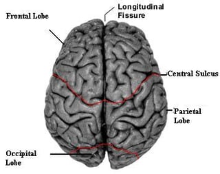
This is a much better design, and a more accurate representation of biology. Good job! However, I still feel that too much emphasis is placed on the destillation setup(?), since it is repeated, and this space could be used more constructively. Personally, I would also like to see multicellular organisms (plant, animal, fungi etc). Good that you added a multicellular organ though, in the form of a brain (it is a brain, right?). However, I suspect that some might find this illustration unclear (I think one earlier comment mentioned this), and it is unfortunate (and inaccurate) that the most prominent structure of the brain in dorsal view is not shown, namely the longitudinal fissure.

enter image description here

I'm also wondering what this: enter image description here is supposed to be? Glasses? That I'm not able to recognize it might be due to my own ignorance though.
Original answer:
Overall, I like the example design. The colour scheme is rather nice (I would maybe prefer somewhat more muted colours) and the general design is peaceful. I also like the examples of how the graphical profile could be used for stickers, t-shirts etc.

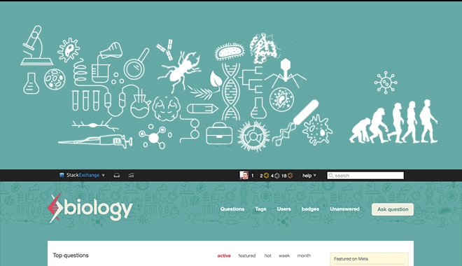
To me, the main problem is that the graphical profile (icons, logo, banner etc) is heavily skewed towards low-level biology, such as DNA and molecular biology. Basically, not a single icon/figure implies evolution, species, populations, ecological communities, field biology etc. It is also notable that not a single organism is depicted - not even a single cell - not to mention an stylized animal, fungus or plant. There is also a lack of mid-level processes/features, such as synapses, cellular membranes (with embedded structures) etc. Other possibilities could be depictions of mendelian genetics or food webs. At the moment, many of the pictures in the banner would work just as well at ChemistrySE (molecules, lab equipment, microscope, beakers, an atom?). So in short: too many molecules and too few organisms and higher level processes.

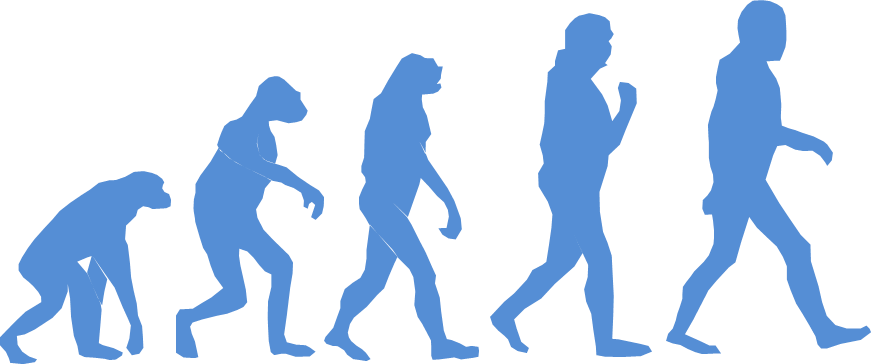
My suggestions would be to modify the "banner" and add some figures of, for instance trees, cells, animals and maybe a phylogenetic tree into the mix (as a comparison, the progression from ape to human is arguably a common depiction of evolution), to better represent the full range of biology. Something that implies interactions between organisms or between organisms and their environment would also be suitable.

I also dislike the badge icons, which to me are too "chemical" (especially taken together with the graphical profile overall). To me, a stylized phylogenetic tree would be just as suitable there.

To some extent, these comments might only be the ecologist in me that is talking. However, I do think that there has to be a better balance, if the design (and in extension, the site) is to welcome the whole range of biology.

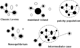
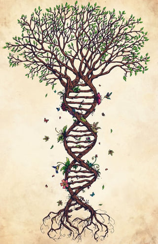
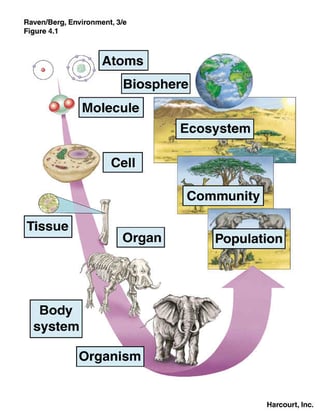
A couple of examples that can be used for inspiration are added below, visualizing (in order of appearance) hierarchical organization, food web, inheritance chart, spatial ecology/metapopulation, "tree of life":

hierarchical organization food web inheritance metapopulation tree of life

$\endgroup$
3
  • 7
    $\begingroup$ I agree with this in general, and I'm much closer to chemistry as a biochemist than an ecologist. The molecules depicted like benzene and the naphtalene derivatite are also not typical for biology, I'd like more something like glucose, ATP or something like that. $\endgroup$
    – Mad Scientist Mod
    Commented May 13, 2015 at 11:09
  • 5
    $\begingroup$ I agree with a lot of what you said, but above all I think the most important thing missing from the design is conceptualising evolution. This is a massive part of how we categorise function at a molecular level. It goes without saying that it's importance in the more pure biological sciences cannot be overstated. It could and should be seen in the design. $\endgroup$
    – James
    Commented May 13, 2015 at 16:44
  • 1
    $\begingroup$ Not to mention too that the naphthalene derivative appears to have 5 bonds coming from a single carbon atom. $\endgroup$
    – March Ho
    Commented May 18, 2015 at 22:36
11
$\begingroup$

enter image description here

Great effort but, I see a few illustrations being repeated. How about we remove the duplicates and put in some chromosomes? Drosophila? A macrophage at work? If you want to draw molecules well then draw an ATP then. That's much more relavant. At that size, the phylogenetic tree is barely recognizable, I'd suggest an increase in its dimensions and decrease in its size (no. of branches). This second version surely is better, but still not as "biological" as it should be.

EDIT: I saw a few other suggestions and came up with this:

enter image description here

A few other things that could be added are an ATP molecule, for lab equipment we can add a couple of falcon tubes(in the bottom left corner), a sperm entering an egg, phagocytosis, maybe a tree of sorts on the right corner and a prehistoric bird flying over the illustration to top it off. What say?

VERSION 2:

enter image description here

$\endgroup$
5
  • 1
    $\begingroup$ Yes, the repetitions could be used in a better way, and I love your added beetle and a micropipette. $\endgroup$ Commented May 19, 2015 at 8:09
  • $\begingroup$ Nice. You seem to be good at designing :) $\endgroup$
    – WYSIWYG
    Commented May 19, 2015 at 8:33
  • 3
    $\begingroup$ I like it, but the evolution picture of an ape from man is hideous imo...it distracts from the consistency of the design $\endgroup$
    – Rover Eye
    Commented May 19, 2015 at 8:41
  • $\begingroup$ @WYSIWYG: thanks......@Rover Eye: It seems to be a distraction for now, but I feel it'll gel in once the picture is complete. Also, I know the initial design was based completely on simplistic wireframe illustrations, I intentionally shifted to this partly fill based one, It seemed less geometric and a bit more organic to me. $\endgroup$
    – Kunal24
    Commented May 19, 2015 at 8:45
  • $\begingroup$ What I had meant as inconsistency was essentially: The evolution figure is 5 figures in one, and that looks it. perhaps we can introduce in a bit more subtlety to the evolution angle ?Instead of showing metamorphosis, perhaps showing struggle for survival. Also, the evolution image has a hard boundary on the lower side, and organic boundaries on the upper side, that distracts too. $\endgroup$
    – Rover Eye
    Commented May 19, 2015 at 9:17
10
$\begingroup$

enter image description here

This dimethylnapthalene doesn't really occur in biological systems as far as I can tell, it's not a molecule one would associate with biology. There's also a superfluous line near it in the bottom left, this looks a bit like it is meant as a double-bond, which would be an impossible structure.

enter image description here

Molecules should never touch any other parts that aren't molecules. All those lines in those structure drawings have precise meaning, connecting them with a schematic that follows entirely different rules is confusing.

enter image description here

This molecule doesn't really play any role in biology as well. The lines on the left of it also don't make any sense.

enter image description here

I assume this is meant to look a bit like a DNA double helix. But displayin it in this way doesn't really make much sense. If this is supposed to be the error page, I'd go with a more conventional looking DNA with a strand break, that might be an appropriate metaphor.

enter image description here

I don't really recognize what this one means, and there are a few more that I don't know. This might be just me, or those icons are really a bit too obscure.

$\endgroup$
3
  • 1
    $\begingroup$ Good point about the DNA strand break. I also cannot recognize the icon at the bottom (along with a couple of other ones). $\endgroup$ Commented May 13, 2015 at 13:25
  • 1
    $\begingroup$ I wonder if the last symbol is like an iPhone text message bubble that indicates the other person is typing? $\endgroup$
    – mdperry
    Commented May 13, 2015 at 23:21
  • $\begingroup$ Is it just me, or does the carbon atom in the molecule have way too many bonds ? $\endgroup$
    – Rover Eye
    Commented May 15, 2015 at 11:29
8
$\begingroup$

My Opinion:

I Love the new logo, and have to agree with it, as the DNA is one thing that can be represented in the restrictions by the SE design philosophy very easily.

Not a big fan of the coloured background though.I like my text on a white parchment background with a coloured header for the page, but then again, its just me.

Biology:

We all must realise that OP has a very daunting task ahead of himself. There are multiple scales wherein biologists operate at (ignoring the whole zoology/botany) routine (and yes, that exists too). In short

The first is the molecular level, where we deal in DNA, RNA, proteins, Cellular pathways

The second major level is the tissue and organ level where we deal with well... tissues and organs (muscles, xylem, nervous etc).

After looking at each individual, biologists also look at interactions between individuals in a population, species and environment, including the ecosystem and biospheres as a whole.

This picture represents what I am talking about: http://www.chesterfield.k12.sc.us/cheraw%20intermediate/DaveEvans/BiologyICP/Notes--LevelsOfOrganization.jpg

(for some reason, I am not able to upload it).

Images in the banner:

Keeping in mind with OP's original design concept, of pencil sketches as background and the numerous ideas from the community, I went hunting in google images and found a few sketches, perhaps more in line with Biology ?.

I am not a graphics designer, so I don't know if these are useful, but figured I'll post them anyway.

enter image description here

enter image description here

enter image description here

We can perhaps remove the chemistry elements from here and instead add elements by @rg255, @terdon and @fileunderwater ? I'll keep updating as I find more.

If anyone wants to know what each of the images are, let me know and I'll edit the post an include the names of the organisms/sketches.

$\endgroup$
8
$\begingroup$

Whoohoottt!! Great news!!!!!!!!! I think many people deserve big kudos for their patience and dedication.

The current design is very pretty and I heavily like the calm colors and yes, green is great. However, I have to agree with others that the symbols look more like an organic-chemistry lab, and not as Biology.

I think that, given the relative abundance of molecular-biological questions, DNA and/or proteins should be visible in the design.

DNA
Source: Forbes

However, as a neuroscientist I would like to add that everything we see and do on Stack Exchange is mediated by our sensory systems and the nervous system. Moreover, I think the relative abundance of neuroscientific questions also objectively justifies some acknowledgement of neurobiology.

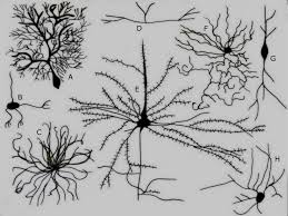
I would like to add a few classical pictures of nerve cells and related items, and I tried to copy the style of the proposed site more or less (i.e., 2D, icon-like images?):

To start with an example of my all-time favorite: a classic silver stain of neurons: neurons
Classic silver-stained neurons. Source: Scientific American

And brain-outlines are also strong representatives of Bio and pretty easily iconized too:

enter image description here enter image description here
Source: various and abundant :)

$\endgroup$
8
$\begingroup$

RE: EDIT 02

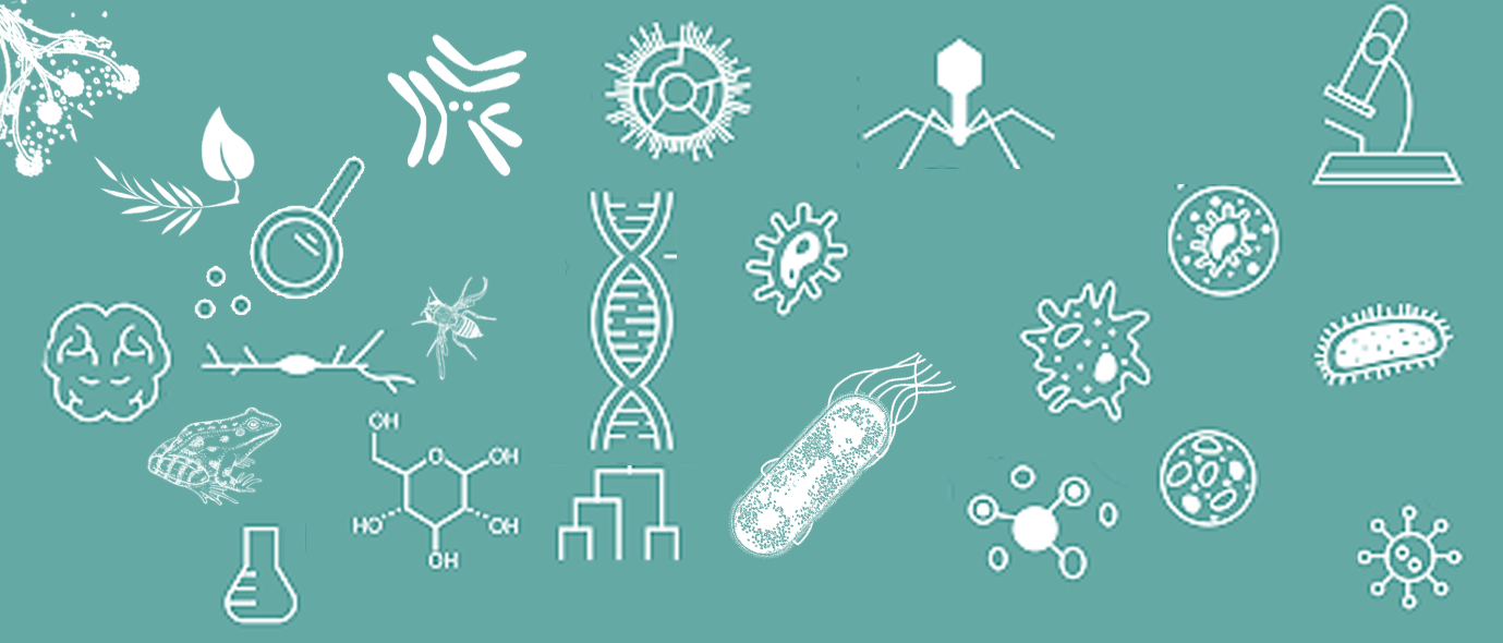
The newer design looks a bit more better, but I personally feel it contains way too many beakers, test tubes and other chemistry stuff. I personally feel it is not organic enough, and hence not "biology", if that makes sense. I am not an artist, but I did a mock up using your base design and added in a few more elements.

enter image description here

The first thing you see is that I ordered the unicellular organisms to the right and multicellular to the left. This is because I wanted to represent the evolution of life here (in truth, I have a bit of an OCD on this, and things for me have to go from small to big). So apologies for ruining your design. But I decided to be a bit random within each group so as to not give a visual clue of a tree.

Speaking of trees, I moved the squarish phylognetic tree out of the way and below the DNA, for essentially two reasons. First, it keeps a hard squarish element in a safe place and doesn't make it clash with the other round elements. Secondly, what I wanted to do was to make one of the strands of the DNA unravel into the phylogenetic tree (As evolution does also have a genetic basis). I also put in a picture of the chromosomes of a drosophila near the DNA.

As for the obvious blank spaces on the unicellular side of things, I really wanted to depict ribosomes convincingly. But I was afraid that it would turn the banner way to molecular. - Thoughts anyone ?

I put the DNA in the middle, because I consider that and evolution, to be biological constants.

Now thats out of the way,

There are many kingdoms in the biological world (archea,eubacteria, protista, fungii, plantae and animalia).

Your revised design had elements of the single celled organisms, but I added in the hideous looking bacteria (e coli; next to the DNA). E coli is used by all molecular biologists and is the backbone for genetic science.

When getting to the multicellular organisms, your revised design did not represent the fungi and plants, and hence I added in the bread mould on the top left corner and a pair of leaves (compound and simple) below the mould.

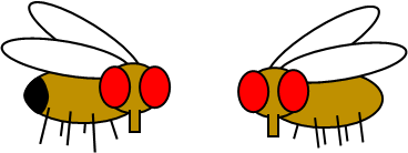
Then coming to the animals, since this is kingdom is large, I decided on a shallow representation, of invertebrates (fly) and the vertebrates (frog). I chose these two organisms because I also wanted to represent the food chain to a very small extent, and a predator-prey relationship.

Overall I feel these elements give a microcosm of the biological world on a smaller (individual) level. But These elements do not justify the macro level interactions that take place.

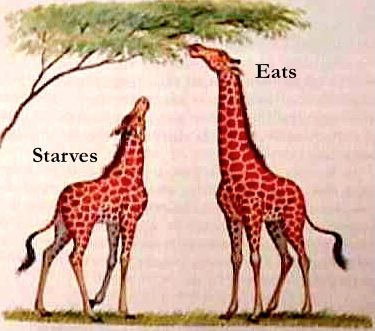
The first and foremost is evolution. The ape from man picture is frankly overused. I think, we can use other design ideas regarding evolution. I hope these pictures give you an idea of what I am talking about:

In short, this picture says that the smaller giraffe and he taller giraffe have a competition for food. The taller giraffe gets the food while the smaller one doesn't. The taller giraffe will survive, and pass on its genes to its offspring whereas the smaller giraffe will eventually die off. Thus eventually, all that are remaining are taller giraffes.

enter image description here

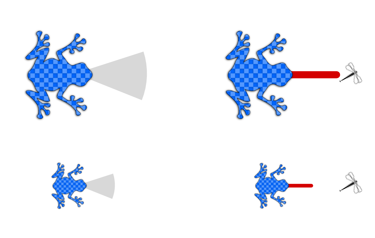
Now, what I wanted to do, but couldn't as I lack the graphical skills, was to adapt the zebra picture into the frog and fly equation. Essentially show it something like this..

enter image description here

The reason I wanted to do this, is because I am a bit of a sucker for the whole "many levels of meaning / deep meaning" stuff. Anyway, there are plenty of other examples, and if you want, we can supply more that may fit in with the theme better ?

Again, apologies for ruining your design. I just had some free time today (!), and just decided to muck about in photoshop.

$\endgroup$
6
$\begingroup$

For illustrations:

Classic model organisms (to name a few)

  • Drosophila
  • Yeast
  • Mice
  • C. elegans
  • Arabidopsis
  • Zebra fish

here are some little illustrations I often use in fly talks:

enter image description here

enter image description here

And drosophila chromosomes:

enter image description here

Illustration of Fishers geometric model of adaptation

enter image description here

(and this link for a more proper diagram)

Other ideas:

  • The DNA should be "inspired" by the original Watson & Crick Illustration
  • Virus
  • Egg & Sperm
  • Microscope
  • Binoculars / Magnifying glass
  • Phylogenetic trees
  • Human body / organs
  • Evolution enter image description here
$\endgroup$
1
  • $\begingroup$ (I prefer the watson crick style DNA because it shows the double helix shape, rather than just a spiral as the illustration proposed shows) $\endgroup$
    – rg255
    Commented May 14, 2015 at 9:11
6
$\begingroup$

Regarding the edited version:

enter image description here

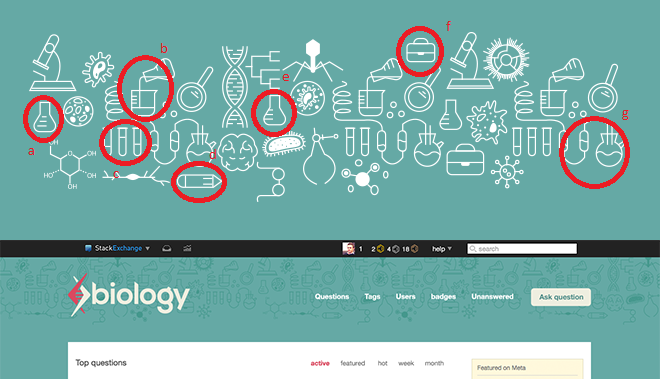
I think (A, B, C, E, G) all feel too chemistry related - one or two of these things is fine, (though the distillation flask [G], condenser [coming out of the distiller], & test tubes [C] feels too far towards chemistry for me). There is a lot of microscopic stuff, biology covers more than molecular and cellular biology.

Is D a pencil?

Is F a lunch box??

Also what is that just below the DNA strand?


Suggestions:

Animals & plants - especially model organisms (flies, yeast, worms, chickens, zebra finch, zebra fish, guppy, beetles, Arabidopsis, tomato, corn, trees)

Make the DNA a helix, not a spiral.

$\endgroup$
6
$\begingroup$

What I like

The palette is spot on and the double helix logo is, if not a bit obvious, very on point. The biochemistry is well represented artistically and the 404 three eyed fish is very humorous!

What else I would try

Shift the focus from organic chemistry to model organisms like bacteria and flies if they can be made to match the style. The evolution of man could be a good one for evolution, but I can't imagine that fitting in with the minimal theme.

Nitpicking

I noticed some flame icons on the book and 404 page. Bunsen burners are only used for keeping equipment sterile rather than any biological testing; flames and biology don't typically get on so it's a bit odd that these were included...

The badge icons are benzene and this isn't really a biological molecule and is more of an organic chemistry iconic molecule (evolutionary biologists may not have seen this since school, and that would have been in a chemistry class). Glucose is a much more biologically well known molecule and the core structure is similar, albeit harder to summarise as a badge!

As for the gorgeous minimalistic glassware. Our glass blower tends to make those sorts of things for the chemical engineers that work in biology, so I presume they are a chemistry thing too. Most biology lab equipment is either simple glass-ware, pipettes, gels, plates of cells, or big magical boxes.

--

EDIT 02 This now looks ideal. If I make any more suggestions I know I will ruin it! The glassware is still there but I think that's not a bad thing. It balances the cellular biology against the old-school biochemistry, which is still an alive and well practice, albeit being carried out by chemical engineers rather than biologists!

$\endgroup$
0
5
$\begingroup$

RE: EDIT 02: I love the neuron - THANKS!!

But I agree with @Bio_geek24 that the triple-repeated images are still kind of organic chemistry:

enter image description here

Erlenmeyers, heat exchangers and even test tubes are rarely encountered in a Bio Lab. It would be OK when shown once, but they do dominate the scene. Sorry for being nitpicky but I'm just trying to help.

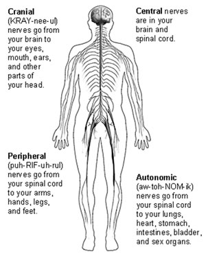
Just to post another nervous system pic that may give you an idea to fill up the gaps (disregard the text, it's about the nerves :-) -

enter image description here

$\endgroup$
4
  • 1
    $\begingroup$ I have used Erlenmeyer flasks and test tubes weekly to culture bacteria. Also, my old PI's lab was literally filled with Erlenmeyer flask of various sizes (some gigantic ones) which he had presumably used at one point. $\endgroup$
    – canadianer
    Commented May 19, 2015 at 6:24
  • 1
    $\begingroup$ @canadianer - I agree, I have used them too. But would you regard the site of erlenmeyers as typically Bio? Not me :) especially not so with pressure release valves and heat exchangers connected to them :) $\endgroup$
    – AliceD Mod
    Commented May 19, 2015 at 6:59
  • 1
    $\begingroup$ That's a good point; I'd think chem before bio (and who wants to think that?!) $\endgroup$
    – canadianer
    Commented May 19, 2015 at 7:00
  • $\begingroup$ @canadianer - yes yes that's my point! It is all OK, but it is too prominent now I think $\endgroup$
    – AliceD Mod
    Commented May 19, 2015 at 7:01
4
$\begingroup$

People seem to dislike benzene as a badge icon because it is not common in biology. I guess they haven't heard of tyrosine but, in any event, I do agree that it looks out of place. How about a simple protein model to replace it?

enter image description here

I'm not sure why I used that colour scheme since badges are actually gold, silver and bronze on a black background, but the idea is there. Obviously a touch artistic flare is required. Some may say that it focuses too much on the molecular side of biology and doesn't encompass the entire field, but these people are likely ecologists and will soon be too busy counting deer to give you any problems ;)

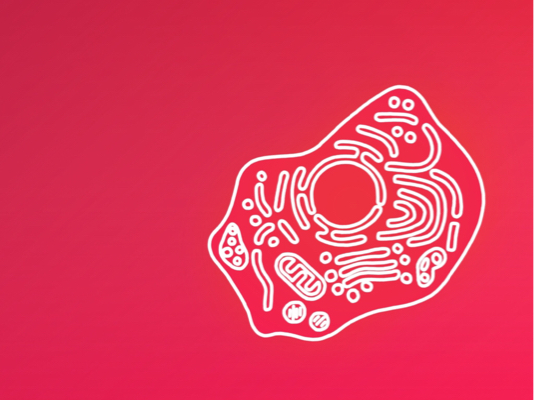
Some kind of stylized bacterium may also look nice, or an amoeba as WYSIWYG suggested. Something in the vein of Alberts' Molecular Biology of the Cell (maybe a little simpler):

enter image description here

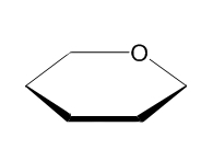
Or maybe a Haworth projection of the pyranose ring. A lot of people were suggesting glucose, but all of the hydroxyls seem like too much clutter.

enter image description here

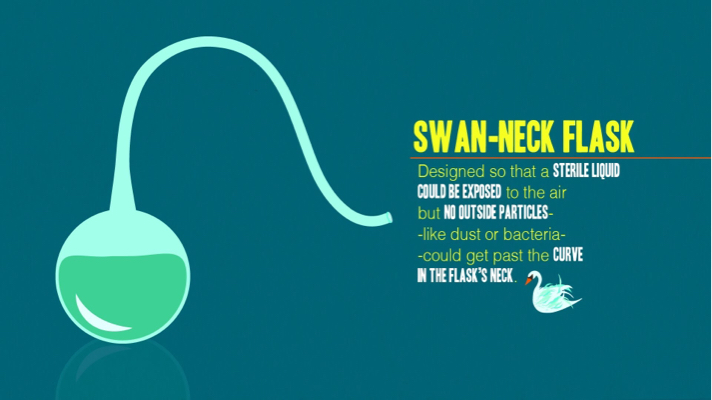
Swan neck flasks are pretty iconic:

enter image description here

I don't know, just throwing out ideas.

$\endgroup$
4
  • $\begingroup$ Considering the size of badges, they seem a little too big. $\endgroup$
    – March Ho
    Commented May 19, 2015 at 6:41
  • $\begingroup$ @MarchHo Obviously some resizing is in order. $\endgroup$
    – canadianer
    Commented May 19, 2015 at 6:43
  • $\begingroup$ What I meant was the things you suggested would not look very recognisable when forced down to 32x32. $\endgroup$
    – March Ho
    Commented May 19, 2015 at 6:45
  • $\begingroup$ @MarchHo I know what you meant ;) I think any of these ideas could be fit into that size and be recognizable. If my computer wasn't 4 flights of stairs away I would give it a shot. $\endgroup$
    – canadianer
    Commented May 19, 2015 at 6:49
3
$\begingroup$

These are some great news. While I like the overall color scheme, I am not so convinced by the actual design. The site logo (which is also used for the badges) is a pretty "edgy" design, I would prefer something more round and "biological" here.

Others have also mentioned the rather chemical design of the stickers, besides technical stuff like microscopes and tubes, I would love to see trees, flowers and animals.

Having some molecules there is ok, but I would choose something which has more relevance in biology like glucose or ATP. I also like the idea of having pathways depicted (although this might be skewed by my own profession :-) ).

$\endgroup$
3
$\begingroup$

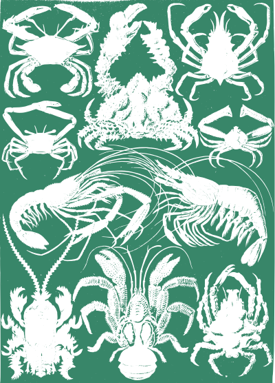
Great design. The color scheme is nice and subtle. I had always liked the pictures from Ernst Haeckel's Kunstformen der Natur. I'm not sure if someone still owns the copyright. Perhaps a line art rendering of one of the illustrations may be a good idea (tribute to Haeckel as well).

                         enter image description here

A DNA or protein gel (as pointed out before) would be great and is perhaps one of the things that all molecular biologists relate to. People have also made many MEMES out of gel pics; so it is definitely a popular thing.

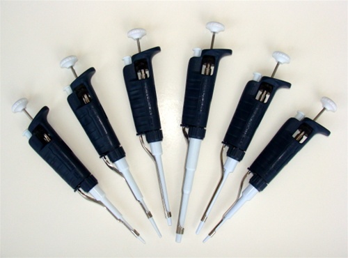
Another thing that many molecular biologists would relate to, is the micro-pipette; it is like an appendage of a molecular biologist/biochemist :P

enter image description here

I feel that amoeba for badge images would be nice. No sharp edges and looks very biological :P enter image description here

$\endgroup$
-3
$\begingroup$

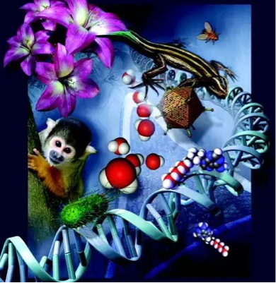
Here is a trimmed version of the cover from our book (so I imagine it's copyrighted), and I saw it evolve through several versions. Our goal was similar, to use recognizable images of important discoveries etc. in Biology:

Principles of Biochemistry 5th Edition

$\endgroup$

You must log in to answer this question.

Not the answer you're looking for? Browse other questions tagged .