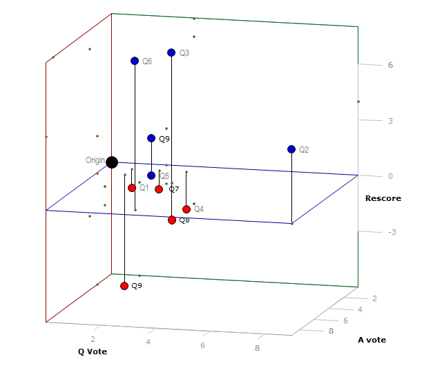
I was playing around with making 3D scatter plots, and needed some data to play with. So I took the results from Oct. Self-Evaluation, but I scored it a different way. I took the net score from the eval ("Rescore") and compared it to the votes of linked question ("Q Vote"), and the votes of the highest voted answer ("A vote").
That gave me the following data table:
\begin{array} {|r|r|r|r|} \hline Question &A ~ Vote &C ~Vote & Rescore \\ \hline Q1 &1 &1 &-1 \\ \hline Q2 &9 &9 &4 \\ \hline Q3 &3 &3 &7 \\ \hline Q4 &1 &3 &-2 \\ \hline Q5 &2 &2 &0 \\ \hline Q6 &8 &3 &8 \\ \hline Q7 &1 &2 &-1 \\ \hline Q8 &3 &3 &-2 \\ \hline Q9 &2 &2 &2 \\ \hline Q10 &2 &1 &-6 \\ \hline \end{array}
Which graphically looks like this (negative Rescore in red):

If I have time, I will go back and look at the other self evaluations and see if I can get any patterns to emerge.
But even with these data points, I'm re-evaluating my voting, though I know it has been discussed in depth. Are we voting in a way that reflects the quality we are or are not bringing to the internet? Should we be voting in such a way that it would be reflected in the Rescore?
I didn't have time to participate in the review, so I'm not entirely sure how the questions were selected (I'm assuming randomly of positive voted questions in the last quarter), but I would be curious how this would play out on the site as a whole (which none of us have time to do).
One last graph, the best liner plane fit that I could get in R:

Just some data for thought.
